360 x 640
640 x 360
375 x 667
667 x 375
1280 x 800
800 x 1280
1280 x 1024
1024 x 1280
1366 x 768
768 x 1366
1440 x 900
900 x 1440
1600 x 900
900 x 1600
1920 x 1080
1080 x 1920
"Webtools - Resize browser window tool" is a simple online utility to test your website responsive UI design across mobile, tablet, laptop and desktop devices.
Tool Guide: Enable browser pop-ups. Enter the URL of your website in the above "Enter Your Website URL" field and select a resolution.
360 x 640
640 x 360
375 x 667
667 x 375
1280 x 800
800 x 1280
1280 x 1024
1024 x 1280
1366 x 768
768 x 1366
1440 x 900
900 x 1440
1600 x 900
900 x 1600
1920 x 1080
1080 x 1920
iPhone 11 Pro Max (414x896)
iPhone 11 Pro Max (896x414)
iPhone 11 Pro (375x812)
iPhone 11 Pro (812x375)
iPhone 11 (414x896)
iPhone 11 (896x414)
iPhone XR (414x896)
iPhone XR (896x414)
iPhone XS Max (414x896)
iPhone XS Max (896x414)
iPhone XS (375x812)
iPhone XS (812x375)
iPhone X (375x812)
iPhone X (812x375)
iPhone 8 Plus (414x736)
iPhone 8 Plus (736x414)
iPhone 8 (375x667)
iPhone 8 (667x375)
iPhone 7 Plus (414x736)
iPhone 7 Plus (736x414)
iPhone 7 (375x667)
iPhone 7 (667x375)
iPhone 6S Plus (414x736)
iPhone 6S Plus (736x414)
iPhone 6S (375x667)
iPhone 6S (667x375)
iPhone 6 (375x667)
iPhone 6 (667x375)
Galaxy Note 10 Plus (360x760)
Galaxy Note 10 Plus (760x360)
Galaxy Note 9 (360x740)
Galaxy Note 9 (740x360)
Galaxy S10 Plus (360x800)
Galaxy S10 Plus (800x360)
Galaxy S10 E (360x760)
Galaxy S10 E (760x360)
Galaxy S10 (360x800)
Galaxy S10 (800x360)
Galaxy S9 Plus (412x846)
Galaxy S9 Plus (846x412)
Galaxy S9 (360x740)
Galaxy S9 (740x360)
Galaxy Note 8 (360x740)
Galaxy Note 8 (740x360)
Galaxy S8 Plus (412x846)
Galaxy S8 Plus (846x412)
Galaxy S8 (360x740)
Galaxy S8 (740x360)
Galaxy S7 (360x640)
Galaxy S7 (640x360)
Galaxy S7 Edge (360x640)
Galaxy S7 Edge (640x360)
Galaxy J3 (360x640)
Galaxy J3 (640x360)
Pixel 3 XL (412x827)
Pixel 3 XL (827x412)
Pixel 3 (412x824)
Pixel 3 (824x412)
Pixel 2 (412x640)
Pixel 2 (640x412)
Pixel 2 XL (412x823)
Pixel 2 XL (823x412)
Pixel (360x640)
Pixel (640x360)
Pixel XL (411x731)
Pixel XL (731x411)
Nexus 6 (360x640)
Nexus 6 (640x360)
Nexus 6P (412x738)
Nexus 6P (738x412)
Nexus 5 (360x640)
Nexus 5 (640x360)
LG K20 (360x640)
LG K20 (640x360)
LG Tribute HD (360x640)
LG Tribute HD (640x360)
LG Aristo 2 (360x640)
LG Aristo 2 (640x360)
LG Stylo 2 (360x640)
LG Stylo 2 (640x360)
LG V20 (360x640)
LG V20 (640x360)
LG K10 (360x640)
LG K10 (640x360)
LG K7 (320x570)
LG K7 (570x320)
Huawei P20 Lite (360x760)
Huawei P20 Lite (760x360)
Huawei P20 Pro (360x747)
Huawei P20 Pro (747x360)
Huawei P20 (360x748)
Huawei P20 (748x360)
Huawei P10 (360x640)
Huawei P10 (640x360)
Huawei P10 Lite (360x640)
Huawei P10 Lite (640x360)
Huawei P9 (360x640)
Huawei P9 (640x360)
Huawei P9 Lite (360x640)
Huawei P9 Lite (640x360)
Huawei P8 Lite (360x640)
Huawei P8 Lite (640x360)
Moto Z (360x640)
Moto Z (640x360)
Moto E4 (360x640)
Moto E4 (640x360)
Moto Z2 (360x640)
Moto Z2 (640x360)
DROID Turbo (360x640)
DROID Turbo (640x360)
Moto Z Play (360x640)
Moto Z Play (640x360)
Moto Z2 Play (360x640)
Moto Z2 Play (640x360)
Moto G5 Plus (360x640)
Moto G5 Plus (640x360)
Redmi Note 5 (393x786)
Redmi Note 5 (786x393)
Redmi Note 4 (360x640)
Redmi Note 4 (640x360)
Redmi Note 3 (360x640)
Redmi Note 3 (640x360)
Redmi 4 (360x640)
Redmi 4 (640x360)
Redmi 4X (360x640)
Redmi 4X (640x360)
ZTE ZMAX Pro (360x640)
ZTE ZMAX Pro (640x360)
ZTE Max XL (360x640)
ZTE Max XL (640x360)
ZTE Blade X (360x640)
ZTE Blade X (640x360)
ZTE Majesty Pro (320x570)
ZTE Majesty Pro (570x320)
ZTE Maven 3 (320x570)
ZTE Maven 3 (570x320)
Alcatel A30 Fierce (360x640)
Alcatel A30 Fierce (640x360)
One Plus 3 (480x853)
One Plus 3 (853x480)
Oppo A37 (360x640)
Oppo A37 (640x360)
Sony Xperia XA (360x640)
Sony Xperia XA (640x360)
Sony Xperia Z3 (360x640)
Sony Xperia Z3 (640x360)
Vivo Y55s (360x640)
Vivo Y55s (640x360)
iPad (768x1024)
iPad (1024x768)
iPad Mini (768x1024)
iPad Mini (1024x768)
iPad Mini Retina (768x1024)
iPad Mini Retina (1024x768)
iPad Pro (1024x1366)
iPad Pro (1366x1024)
iPad Retina (768x1024)
iPad Retina (1024x768)
Galaxy Tab 10 (800x1280)
Galaxy Tab 10 (1280x800)
Nexus 10 (800x1280)
Nexus 10 (1280x800)
Nexus 9 (768x1024)
Nexus 9 (1024x768)
Nexus 7 13inch (600x960)
Nexus 7 13inch (960x600)
Xperia Z4 Tablet (800x1280)
Xperia Z4 Tablet (1280x800)
iMac 27 (2560x1440)
iMac 27 (1440x2560)
iMac 5K (2560x1440)
iMac 5K (1440x2560)
MacBook 12 (1280x800)
MacBook 12 (800x1280)
MacBook Air 13 (1440x900)
MacBook Air 13 (900x1440)
MacBoo Air 11 (1366x768)
MacBoo Air 11 (768x1366)
MacBook Pro 15 (1440x900)
MacBook Pro 15 (900x1440)
MacBook Pro 13 (1280x800)
MacBook Pro 13 (800x1280)
Surface (1366x768)
Surface (768x1366)
Surface 2 (1280x720)
Surface 2 (720x1280)
Surface 3 (1280x720)
Surface 3 (720x1280)
Surface Book (1500x1000)
Surface Book (1000x1500)
Surface Pro (1280x720)
Surface Pro (720x1280)
Surface Pro 3 (1440x960)
Surface Pro 3 (960x1440)
Surface Pro 4 (1368x912)
Surface Pro 4 (912x1368)
Building responsive website is a challenging and demanding endeavour especially testing of website on devices of all shape and sizes. It is economically not feasible to test responsive website on all available smartphones, tablets, laptops and desktops. This is where "Webtools - Resize Browser Window Tool" comes to help.
"Webtools - Resize Browser Window Tool" helps you simulate any device be it smartphone, tablet, laptop or desktop by re-sizing web browser window to fit the viewport or breakpoint size of the target device. "Webtools - Resize Browser Window Tool" helps you to do quick visual check of your website across different devices to identify any major rendering issue much early in development and testing phases.
Even though "Webtools - Resize Browser Window Tool" will give you a fair idea of how your website will look across devices it should not be the only way you test your responsive website. It is highly suggested to test your website on actual devices.
Responsive web design (RWD) is a website UI design approach aimed at crafting web pages that changes appearance / layout depending on the screen size and orientation of the device being used to view them. RWD make use of media queries, flexible grid-based layout, flexible images and media, and CSS to create dynamically changing web pages.
RWD tries to resolve the problem of designing for multitude of device screens - smart TV, desktops, laptop, tablet or mobile phones. RWD promote single codebase to support all devices than the traditional approach of having different codebases for each type of device.
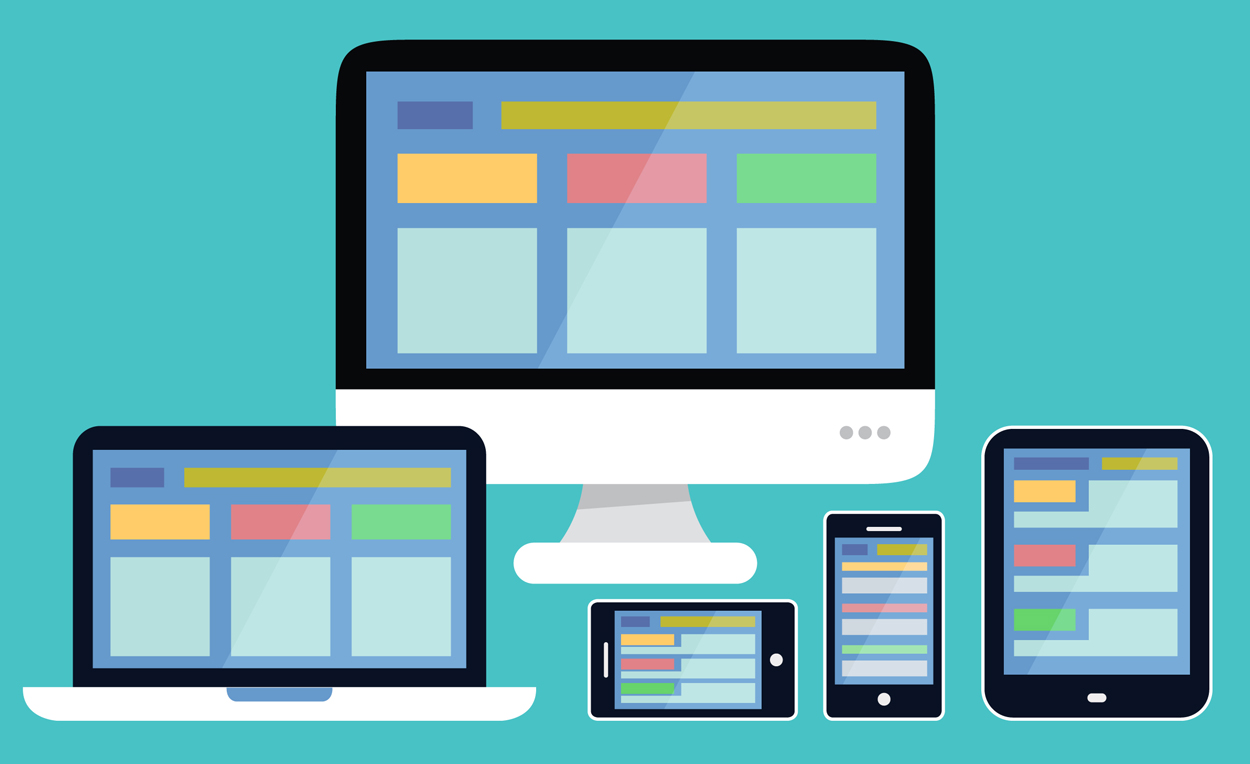
RWD results in websites that respond to the device screen size and orientation that are accessing them, displaying the information in an optimal way for the available screen size. As the device viewport grows or shrinks, the web page layout or its elements size, location, visibility changes for optimal viewing. For example, a three-column desktop design may change to two columns on a tablet and a single column on a mobile.
A "non responsive website" will render almost the same on all sort of devices, be it a desktop or a mobile. Whereas a "responsive website" adapts to screen size, and orientation of device accessing them. A responsive website, for example, may have horizontal menu bar on desktop which changes to hamburger icon placed on either top corners on mobile.
So how to check if a website is responsive? There are multiple approaches to check website responsiveness. Best approach to test will be to check your website on multiple actual devices ranging from small screen device like wearable watch, smartphone to large screen devices like laptop, desktop and smart TV. If your website is not rendering properly on any of the device then the website is not responsive at least for that device type.
As you must have realized by now, the best approach is not the most economically feasible test. It is not feasible to buy all devices to test website responsiveness. As a work around many companies has come up with device emulators plugins which are software mimicking specific device screen size, resolution and other capabilities. Google has come up with Android Emulator from Google for testing website responsiveness on android mobiles.
Another recommended approach for testing website responsiveness is to access the website in a browser by adjusting the browser width and height in accordance to the target device viewport resolution. If the website renders properly in the browser then in most cases the website will render correctly in the actual device too.
Adjusting browser dimensions to mimic device resolutions works fine if you want to test your website responsiveness on one or two devices, but if you want to test against large number of devices then manually adjusting browser dimensions will be a tedious and error prone task. And also, you have to remember resolutions of all the devices you want to test your website on. "Webtools - Resize Browser Window Tool" can help you in testing your website responsiveness in browser against 100 popular devices by a simple click of a button.
"Webtools - Resize Browser Window Tool" is easy to use online utility which helps you test your website look across wide range of mobile phones, tablets, laptop, desktop and smart TVs from all major brands like Apple, Blackberry, Google, LG, Samsung, Vivo, Xiaomi and many more.
When you choose a device resolution from the provided device options, our free tool will open your website in a new browser window having resolution consistent with the resolution of the selected device. This way you can instantly check your website responsive design in a particular browser running on the selected device. With our free tool you can test your website on as much devices as you want with ZERO cost.
Let say you want to check how your website will look in Chrome browser in portrait mode on iPhone 11. Start with accessing "Webtools - Resize Browser Window Tool" in a Chrome browser, enter the URL of your website in the "Enter Your Website URL" field. Then click on the iPhone 11 button in the mobile section. Our tool will open your website in a new Chrome browser window having same resolution as iPhone 11. If your website is rendering properly in the new window then there is high chance that your website will render correctly on actual iPhone 11 too.
"Webtools - Resize Browser Window Tool" is an easy to use utility. Follow below simple steps to test responsiveness of your website in different browsers across different devices.
Our tool will open your responsive website in a new browser window having screen resolution same as the selected device viewport resolution.
There are many benefits in using "Webtools - Resize Browser Window Tool"
"Webtools - Resize Browser Window Tool" provides an easy way to test your website responsiveness on different iPhone models. Follow below steps to check your website responsiveness on iPhone mobiles.
Your responsive website will open in a new browser window having same screen resolution as the selected iPhone.
"Webtools - Resize Browser Window Tool" provides an easy way to test your website responsiveness on different Samsung mobile models. Follow below steps to check your website responsiveness on Samsung mobiles.
Your responsive website will open in a new browser window having same screen resolution as the selected Samsung mobile.
You can link this tool by copying and pasting below HTML code in your page:
<a href="https://www.webtools.services/resize-browser-window-tool">Resize Browser Window Tool</a>
Help us make "Resize Browser Window" tool better by submitting an issue or a feedback today.